
A hands-on walkthrough of Error Analysis, Model Overview, Data Analysis, Feature Importances, and Counterfactuals — applied to a real-world bank account fraud detection model.
- Introduction to Responsible AI
- The Dataset: Bank Account Fraud Detection
- Building the RAI Pipeline
- Error Analysis — Where Does the Model Struggle?
- Model Overview — Performance at a Glance
- Data Analysis — Understanding Your Data
- Feature Importances — What Drives Predictions?
- Counterfactuals — What Would Change the Outcome?
- Beyond This Dashboard: Components Not Covered
- Looking Ahead: RAI Impact Assessment & Standard
01 · Introduction
What Is Responsible AI – And Why Does It Matter?
As machine learning models increasingly influence high-stakes decisions from credit approvals and fraud detection to hiring and medical diagnosis the question of how a model reaches its conclusions becomes just as important as whether it reaches correct ones. A model that achieves 84% accuracy on a fraud detection task may still be systematically failing a particular demographic, treating missing data as a red flag, or drawing on features that should have no business relevance.
Responsible AI (RAI) is the discipline of building, evaluating, and deploying machine learning systems that are transparent, fair, reliable, and accountable. Microsoft has embedded this philosophy directly into Azure Machine Learning through its RAI Dashboard a unified interface combining error analysis, model explainability, data exploration, and counterfactual what-if analysis into a single navigable view.
This post walks through each component of the RAI Dashboard using a real LightGBM classifier trained on the Bank Account Fraud Detection dataset. Rather than focusing on how to set up the dashboard, we focus on how to read and interpret what it shows you for both technical practitioners and business stakeholders.
A common issue when using the RAI Dashboard is a warning about incompatible package versions. Ensure your environment pins raiwidgets, responsibleai, interpret-community, and erroranalysis to matching versions from the RAI requirements file. Mismatched packages can grey out components like the Error Heatmap.
02 · Dataset
The Dataset: Bank Account Fraud Detection (NeurIPS 2022)
The model in this walkthrough was trained on the Bank Account Fraud (BAF) Dataset, introduced at NeurIPS 2022. It is specifically designed to benchmark fraud detection under realistic conditions including class imbalance, temporal drift, and demographic fairness considerations. We use the Base variant of the dataset.
Each row represents a single bank account opening application. The target variable indicates whether the application was fraudulent (1 = Fraud, 0 = Not Fraud). The dataset is intentionally challenging fraud cases are a small minority of all applications, and several features exhibit distribution shifts that make generalisation difficult.
- Binary Classification
- Tabular Data
- Fraud Detection
- Class Imbalance
- NeurIPS 2022
| Feature | Description |
|---|---|
| housing_status | Applicant’s housing arrangement (BA, BC, BE, BF, …) |
| current_address_months_count | Months lived at current address |
| prev_address_months_count | Months at previous address (-1 = missing) |
| has_other_cards | Binary — whether applicant holds other payment cards |
| device_os | Operating system of the device used to apply |
| velocity_6h | Applications submitted from same source in past 6 hours |
| phone_home_valid | Whether the provided home phone number is valid |
| income | Normalised income score (0–1 scale) |
| credit_risk_score | Internal credit risk score |
| name_email_similarity | Similarity score between applicant name and email address |
03 · Building the RAI Pipeline
Constructing the RAI Dashboard with Azure ML Components
The RAI Dashboard is built as a pipeline of registered components pulled from the Azure ML registry. Each component targets a specific analytical lens. It is critical to fetch all components at the same version mixing versions is a common source of dashboard rendering failures.
# Connect to the Azure ML registry that hosts RAI components
registry_name = "azureml"
ml_client_reg = MLClient(credential, subscription_id, resource_group,
                          registry_name=registry_name)

# Pull all analytical components at the same version
rai_ctor        = ml_client_reg.components.get(name="rai_tabular_insight_constructor", label="latest")
v               = rai_ctor.version
rai_explain     = ml_client_reg.components.get(name="rai_tabular_explanation",     version=v)
rai_counterfact = ml_client_reg.components.get(name="rai_tabular_counterfactual",  version=v)
rai_error       = ml_client_reg.components.get(name="rai_tabular_erroranalysis",   version=v)
rai_gather      = ml_client_reg.components.get(name="rai_tabular_insight_gather",  version=v)
rai_scorecard   = ml_client_reg.components.get(name="rai_tabular_score_card",      version=v)
print(f"RAI components version: {{v}}")
The rai_gather component is the final step — it assembles all individual insights into the unified dashboard. Pipeline flow:
04 · Error Analysis
Error Analysis — Where Does the Model Struggle?
The Error Analysis component answers a fundamental question: is model error randomly distributed, or concentrated in specific subgroups? A model with a 16% overall error rate could be failing uniformly, or catastrophically wrong for one particular cohort. The Error Tree reveals which scenario you are in.

Reading the Error Tree
Each node shows errors / total. The root node confirms the global picture — 780 out of 4,900 test instances were misclassified (~15.9% error rate). The first split on housing_status == BA immediately isolates a problematic subgroup. A second split on has_other_cards <= 0.00, then a third on current_address_months_count > 35.50, leads to the darkest, most error-saturated node in the tree.
The worst-performing cohort — applicants with BA housing status, no other cards, and current address tenure exceeding 35 months — has an error rate of 340 out of 525 (64.8%). The model is getting nearly 2 out of 3 predictions wrong for this group. The right branch (non-BA applicants, 4,054 total) has an error rate of just 8.8%.
For a fraud model, misclassification is not symmetric. A false negative (missing actual fraud) carries direct financial loss. A false positive (flagging a legitimate customer) creates friction and operational cost. The error tree tells risk teams exactly which customer profiles should trigger additional human review, and tells data scientists exactly where to focus retraining.
05 · Model Overview
Model Overview — Performance at a Glance
The Model Overview tab presents aggregate performance metrics, a confusion matrix, metric visualisations, and a probability distribution plot — a 360-degree view of how the model behaves across the full test set.
Aggregate Metrics

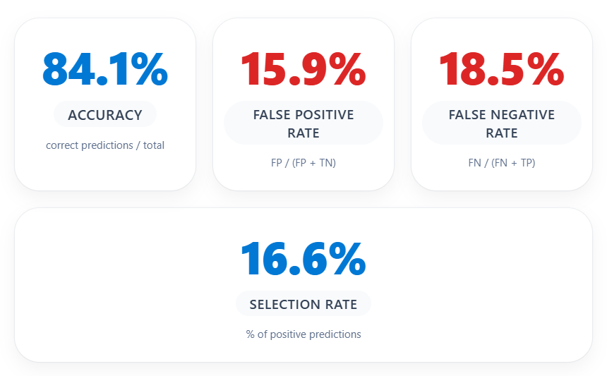
At first glance, 84.1% accuracy appears reasonable. However, for a fraud detection model, accuracy alone is misleading due to class imbalance. The metrics that matter more are the False Negative Rate (18.5%) — representing fraud cases the model missed — and the False Positive Rate (15.9%) — representing legitimate customers incorrectly flagged.
Confusion Matrix

Of the 54 actual fraud cases, the model correctly identified 44 but missed 10 (false negatives = undetected fraud). Of approximately 4,846 legitimate applications, 770 were incorrectly flagged as fraudulent — a significant false alarm rate that would create substantial operational burden if every flagged case required manual review.
Recall Score

The recall bar confirms a fraud class recall of 81.5% — the model catches just over 4 in 5 fraud cases. The remaining 18.5% miss rate is a tangible risk in a banking context. Depending on business risk appetite, the decision threshold may need to be lowered, or targeted retraining on the cohorts identified in Error Analysis may improve recall without inflating false positives.
Probability Distribution

The orange distribution (Not Fraud) is tightly clustered between 0 and 0.2, while the blue distribution (Fraud) is concentrated between 0.65 and 1.0. The wide gap between 0.2 and 0.65 indicates a clean decision boundary — the model is making confident, not marginal, predictions. This separation is a hallmark of a well-calibrated model.
06 · Data Analysis
Data Analysis — Understanding Your Data Distribution
The Data Analysis tab allows you to explore feature distributions across cohorts and inspect individual predictions. It is particularly useful for surfacing data quality issues, class imbalance, and patterns in misclassified cases.
Income Distribution

The income feature shows a remarkably consistent distribution across all five data segments. The median sits around 0.8 with an IQR of approximately 0.4–0.8. This uniformity is a positive signal — no significant temporal drift, and the model is not learning from a skewed income representation in any segment.
Velocity_6h Distribution

The velocity_6h feature captures applications submitted from the same source in the preceding 6 hours. The median sits around 5,000–7,500 with outliers reaching 15,000+. These extreme outliers are a classic fraud signal — representing coordinated or automated application bursts.
Incorrect Predictions — Table View

The table view filters to incorrect predictions (780 cases). Every visible row shows TrueY = Not Fraud, PredictedY = Fraud — these are false positives. More importantly, every visible row has prev_address_months_count = -1, encoding missing or unavailable previous address history.
The systematic presence of prev_address_months_count = -1 across false positives strongly suggests the model has learned to associate missing address history with fraud risk. While statistically valid, this could disproportionately penalise young applicants, recent immigrants, or people who have recently relocated — raising fairness concerns.
07 · Feature Importances
Feature Importances — What Is Driving Predictions?
The Feature Importances tab provides both global (aggregate) and local (individual) explanations powered by SHAP values computed by the interpret-community library.
Global Feature Importance

Globally, the model relies on four features: device_os (~0.43), housing_status (~0.40), phone_home_valid (~0.37), and prev_address_months_count (~0.36). The tight clustering of scores indicates the model is not over-reliant on any single predictor. The prominence of device_os is notable: in fraud detection, the OS is a proxy for whether an automated or spoofed device was used.
Individual Feature Importance — Absolute Values


Selecting five misclassified instances reveals a striking pattern: housing_status is the single most important feature for nearly all selected rows, with importance scores around 1.0–1.2. This is directly consistent with the Error Tree — BA housing status is the first and most powerful split, and local explanations confirm the model disproportionately penalises this housing category at the individual level.
Signed Feature Importance — Class: Fraud

The signed importance view is the most interpretively rich chart. Negative SHAP values push toward Not Fraud; positive values push toward Fraud. The tooltip reveals that for Rows 43, 50, 59, and 123, housing_status SHAP values are strongly negative (around –1.0 to –1.17) — meaning housing_status is actually pulling these predictions away from fraud — yet the model still predicted Fraud.
For most selected false positives, housing_status pushes the model away from a fraud prediction in signed terms, yet these cases are still classified as Fraud. Other features not shown in the top-4 view are overriding the housing status signal. Expanding the slider to show more features will reveal which combination is tipping the balance.
08 · Counterfactuals
Counterfactuals — What Would Change the Outcome?
Counterfactual analysis answers one of the most practically useful questions in ML: What is the minimum change to this applicant’s profile that would flip the model’s prediction? This is the What-If engine of the RAI Dashboard, powered by the DiCE (Diverse Counterfactual Explanations) library.
Probability Scatter — Index 2 (Current Class: Not Fraud)

The scatter plot shows the distribution of predicted probabilities for Index 2 — a case currently classified as Not Fraud. Each horizontal band represents a different feature level (income on y-axis). The goal of counterfactual analysis is to find the smallest perturbation that moves this data point into the Fraud prediction region.
Top Features to Perturb

device_os leads at approximately 70%, followed by housing_status and proposed_credit_limit at ~65%. Notably, several features including phone_home_valid, phone_mobile_valid, has_other_cards, source, and device_fraud_count have a bar height of zero — no counterfactual path required changing these features, confirming they provide no leverage at the decision boundary.
Counterfactual Examples Table

The reference datapoint (Row 2): device_os = linux, housing_status = BC, proposed_credit_limit = 200, name_email_similarity = 0.664, credit_risk_score = 113, velocity_6h = 9,406. All 10 counterfactual examples flip this to Fraud through consistent patterns: changing device_os to windows or other, shifting housing_status to BA, BE, or BF, dramatically increasing proposed_credit_limit to 848–1,897, lowering name_email_similarity (name/email mismatch), and reducing velocity_6h to 2,000–5,800.
| Feature | Reference (Row 2) | Common Counterfactual Pattern |
|---|---|---|
device_os | linux | windows, other, x11 |
housing_status | BC | BA, BE, BF |
proposed_credit_limit | 200 | 848–1,897 (much higher) |
name_email_similarity | 0.664 | 0.088–0.391 (lower) |
credit_risk_score | 113 | 100–348 |
velocity_6h | 9,406 | 2,056–5,812 (lower) |
Counterfactuals give risk teams an actionable language for fraud signals. A legitimate applicant on a linux device applying for a modest credit limit with a matching name and email is low risk. The same applicant on an unrecognised device, applying for a much higher limit, with mismatched contact details and a BA housing status, crosses into the model’s fraud territory. These are concrete, auditable thresholds — not a black box.
09 · Components Not Covered
Beyond This Dashboard: RAI Components Not Covered
Fairness Assessment
The rai_tabular_fairness component evaluates model performance across sensitive demographic groups — measuring demographic parity, equalised odds, and disparate impact. Given that prev_address_months_count = -1 is prevalent in false positives, a Fairness Assessment would quantify whether this disproportionately affects specific cohorts such as recent immigrants or young applicants.
Causal Analysis
The rai_tabular_causal component estimates the causal effect of feature changes on outcomes. While Feature Importances tells you which features are associated with fraud predictions, Causal Analysis answers whether changing a feature would actually cause a different outcome — a distinction critical for policy decisions.
Score Card
The rai_tabular_score_card generates a structured PDF report summarising model performance, feature importances, and fairness metrics suitable for stakeholder communication and regulatory documentation. In this walkthrough it did not render due to the environment compatibility issue.
10 · Looking Ahead
Paving the Way: RAI Impact Assessment & Microsoft’s RAI Standard
Microsoft’s Responsible AI Impact Assessment
Before deploying any AI system, Microsoft’s RAI Impact Assessment guide recommends a structured evaluation of potential harms and benefits — identifying affected stakeholders, mapping failure modes, and assessing severity for vulnerable populations. The insights from the RAI Dashboard feed directly into this assessment. The 64.8% error rate for the BA cohort is a concrete, quantified starting point for that conversation.
Microsoft’s Responsible AI Standard
Microsoft’s Responsible AI Standard defines six principles — Fairness, Reliability & Safety, Privacy & Security, Inclusiveness, Transparency, and Accountability — and maps them to concrete engineering requirements. The RAI Dashboard directly operationalises several: Error Analysis supports Reliability, Explainability supports Transparency, Fairness Assessment supports Fairness, and Counterfactuals support Accountability.
A future post in this series will walk through completing a full Responsible AI Impact Assessment for the bank account fraud detection model — using the findings from this dashboard as the evidence base. We will also explore how the RAI Standard’s requirements map to specific dashboard outputs and what remediation looks like in practice.
Responsible AI is not a checkbox — it is an ongoing practice of interrogating your model’s behaviour from multiple angles. For the bank account fraud detection model evaluated here, the dashboard has surfaced four concrete, actionable findings: a critical failure cohort (BA, no cards, long address tenure); a false alarm pattern linked to missing address history; housing status and device OS as dominant prediction drivers; and a clear counterfactual signature for what tips a profile from safe to suspicious. These are not abstract metrics — they are the starting point for a more reliable, more transparent, and more equitable model.